Earlier we told you about 13 things that every optometry website needs. Now, it’s time that we delve into the various others aspect of an optometry website that can have an impact on your business in the grand scheme of things. Do you want to have one of the best optometry websites in comparison with your competitors? If so, then it would be high time to do something about it.
Why Should You Have One of the Best Optometry Websites?
Your website is a reflection of your business and is a picture perfect portrayal of all that you are and all that your business stands for at a glance. Share on XThus, if your website is sloppy, has bugs and navigational errors and is extremely aesthetically displeasing, then you are certainly in a big problem.
What Is The Issue Here?
The biggest problem that medical professionals like optometrists face once they decide to create a website for their business is lack of knowledge as to what goes on the website and what elements hold more importance than others Share on X. There are a number of different factors that go into the construction of a website. Each and every one of these factors holds equal importance. Everything you decide to put on your website needs to be given proper attention and care. Even though you always have the opportunity to upgrade and redesign your website to keep up with the evolving times, ensuring that your website works properly is more important than just about anything.
Thus, whether you are an optometrist or ophthalmologist who is just venturing into the digital age and need a new website for your business or are someone who wants to redesign their website, you have come to the right place.
Things To Keep In Mind While Redesigning Your Optometry Website
Like just about everyone else, a website is very important to medical practitioners. Thus, various websites have already introduced optometry website design templates to help business owners have their very own website. Various websites also offer an optometry website builder, like Situdio, which allows optometrists to design and customize their very own website.
But, regardless of countless builders you can get your hands on, they do not really matter unless you know what you are doing and how to do it right.
Thus, without further ado, here is a look at some of the most basic and the most crucial parts of a website.
Layout, Theme and Color
When you start a business, as soon as you decide on a name for your business, you move on to choosing the right theme and the various colors that complement you and your business perfectly. A similar approach is certainly the perfect one when it comes to dealing with a website. Choosing the right colors and theme and mixing them up to achieve the right layout and maintain a balance between text and images is of paramount importance. Given that we are discussing the perfect website for an optometrist, it goes without saying that it should follow the typical healthcare website design.
Responsiveness
A responsive optometry website is a great website to have across all fronts really. Not only does it give you a great SEO boost, but great for your business overall. It is seen that if a user has a positive experience with your mobile website, it is most likely they will stay and buy the product. If not, they will move on to another website. Additionally, if your optometry website marketing strategy includes blogging and social media aspects, you are more likely to see better traffic coming your way. Thus having a responsive optometry website is great for you especially since 55% of social media usage takes place on a mobile device.
Homepage
Your homepage is, without doubt or dispute, the single most important page of your entire website. Share on XYour homepage is, without doubt or dispute, the single most important page of your entire website. It is like the benchmark that sets the standard for your entire website. For an optometry website, or any medical website, there are certain things that they should contain.
The best optometry website would certainly be one that contains the number of doctors that practice has. It should also contain the various services being offered by the practice as well as the equipment you have on board. It should contain your contact number and address. Adding a Google Maps link to your website homepage will also work wonders for your business. Also, mentioning your office hours on the homepage as well as the link to various printable forms will also be a huge improvement. If you want the option to allow your patient to book an appointment online, the link to it should be on the homepage too.
Content
Good content is crucial to just about anything. If you want your website to be one of the best optometry websites out there, then you need to put serious effort into your website content. Work on your website in a way that a person who has no knowledge about medical procedures and medical equipment will be able to understand you and your practice to some extend. Add to it the testimonials of your satisfied customers and a few scientific articles busting various optometry related myths and legends and you are all good to go.
Page Speed
Though seemingly unbelievable, it has been observed that if your website takes longer than 10 seconds to load, your visitor will move on to another website. A number of different things impact the loading speed of your website.
This includes and is not limited to:
- The number of requests to the server.
- The size of each individual image.
- Scripts used on the website.
Thus, when you want to build one of the best optometry websites in the market, make sure that the data going on your website is not slowing it down. It is true that some things are crucially important and need to be present on a certain page, there is still a way to go about things. Try to mix, match and manage the page by reducing the number, size and quality of the images. Also, there are number of websites and services online that allow you to check how long your website is going to take to load. A good tool to use here would be gtmetrix. It can check the speed of your website and in case you come across a bad score, you always have us. We are always here to help you to optimize page speed of your website.
Font and Typeface
Whether it is a printed article, a webpage or even a simple document, font and typeface is key. Choosing the right font and Typeface and formatting the content to perfection is the right way to go about things. Now, when it comes to an optometry website, there is a different standard. Most of the visitors are looking for an optometrist, so there are certain sections that may require you to use large typefaces and bold fonts.
20 Best Optometry Websites That Know What They Are Doing
Although this may seem to you as a hefty list but these following designs can help you market your optometry business.
1. https://www.jins.com

JINS prescription eyewear is an optometry website that deals with the provision of eyeglasses and sunglasses. Now the idea behind the website as well as the website itself is a good one since prescription eyewear is something that takes the backseat when it comes to fashion. Now, what JINS prescription eyewear has done is taken something we are all familiar with and scaled it up.
Not only does the page speed of 4.4 seconds speak for itself, but the sleek layout of the homepage with all around clean lines and brilliantly though out drop-down menus, work brilliantly with the website. Since it is an e-commerce website, they way the website is setup is quite good. The filters on various pages, the way the website navigates and the content up on the website – all these are so good that it can easily prompt the visitor to make a purchase.
2. https://www.warbyparker.com

Well, who doesn’t like a good questionnaire that revels facts about your personality that you never knew or could have guessed. This marketing strategy from Warby Parker is not only brilliant but is more than enough to make people open their wallets and actually buy the product. Not only that, but the website is extremely well designed. The images are spot-on, letting people know the various shapes prescription glasses are available in. This is a good thing because most people are not well versed when it comes to eyeglasses shape, color and material. This may just be one of the best optometry websites on the list, except for a couple of things. The website takes 14 seconds to upload, which isn’t a good thing considering 10 second is upload limit for a good website. Additionally, although they are very expressive with the images but the content on the page is fairly minimal, putting this website slightly in the red zone.
3. http://www.perspectiveyes.com

With perseptiveyes that name alone is an indication that someone put a whole lot of effort into the website. It is well built website with an excellent 8 second load time. The homepage is quite neat and well designed, with ample information regarding just about everything. Being an eyecare facility, the prescribe eyewear to the people that need it. Thus, mentioning their office hours on the website is a good move. The website does load quickly but compared to other amazing ophthalmology websites.
4. http://www.bayridgefamilyeyecare.com
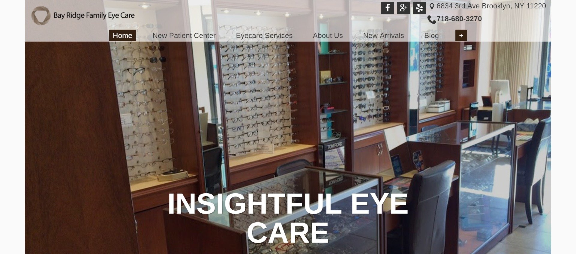
Bayridge Family Eyecare, as the name suggests, is a family based eyecare centre in Brooklyn. Much like its name, the website has a homely feel to it. Unlike most optometry websites which are set up to give it a modern and sophisticated look, Bayridge Family Eyecare is going for something which makes their visitors feel comfortable and at ease and it is actually working. The website has a load speed of 2.1 seconds which is amazing. Add to it the number of eyecare blogs they post on a regular level and the information they have regarding their store and the google maps link to it on the homepage, Bayridge Family Eyecare know what they are doing.
5. http://www.batteryparkvision.com

Unlike some of the best optometry websites out there, battery park division have taken a whole new approach to website creation and design. The website takes 5 seconds to fully load, which is a good thing. Their homepage is minimalist in style and basically, contains links to all the relevant pages that visitors are looking for. Add in the content they have on the website that is just enough to provide its users with information without being too wordy. The website is well created by its people and optimized to perfection the way we see it and is something other people may like as well.
6. https://www.mottoptical.com
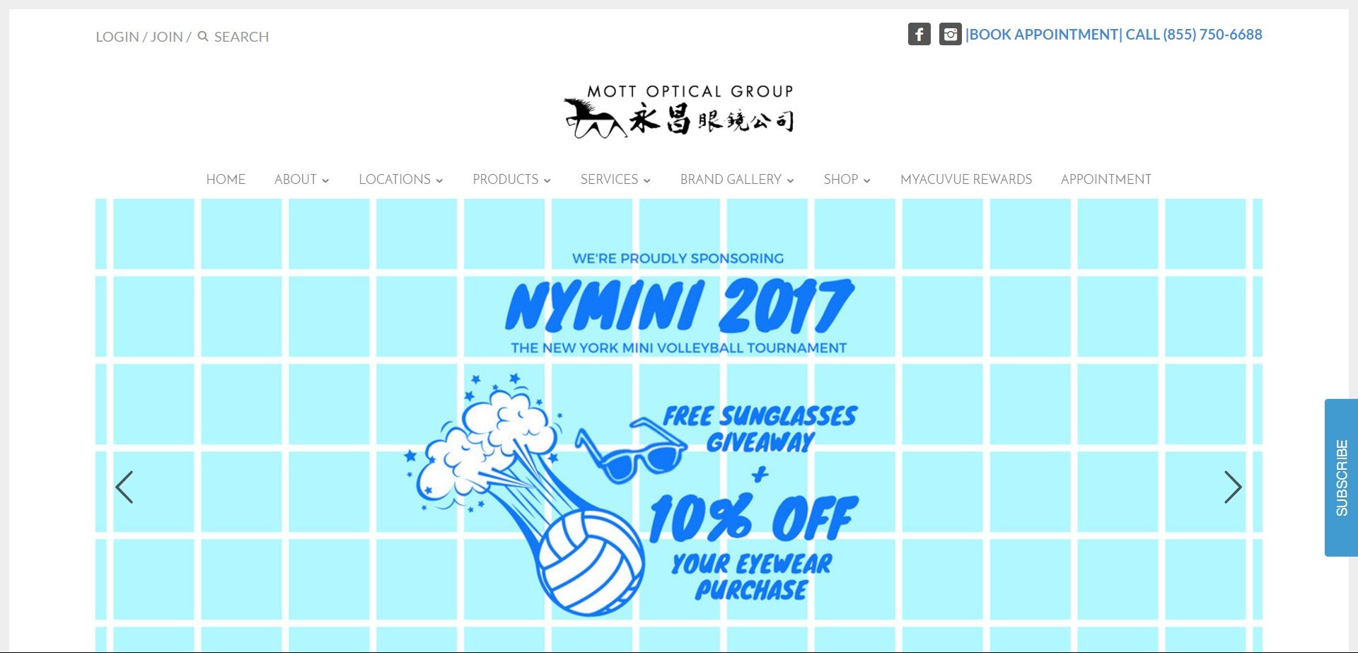
In the age of technology, everybody has a unique and one of a kind approach to designing their very own website. There are so many options available that anyone can do anything and come up with a website that fits their style as well as business. Now, that is what mott optical has done. As soon as the website opens, we are directed to a landing page featuring the latest updates and some of the best things about the website. It is sleek, it is classy and it is one of a kind. Another thing well done about the website is its theme and its layout. With a white background that is filled with colorful imagery and all sorts of amazingness, this website certainly belongs on the list of best optometry websites that know what they are doing. Add to it the full load time of 9.9 seconds and you have a winner on your hands.
7. http://www.cohensfashionoptical.com
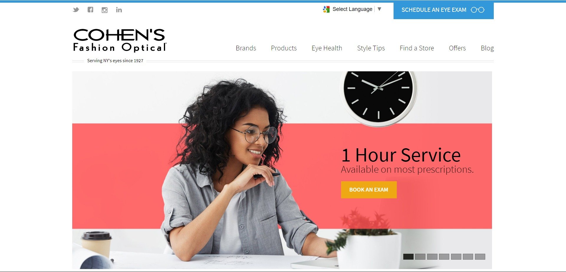
To start off, there are three things about the website that completely stands out in every single way. The slider on top shows the best of the best about the website on its home. Following the slider are two very essential things that every good optometry website should have i.e. find a store near you and schedule an exam. Giving its visitors the ability to find the nearest store instead of sending them off on a goose chase is an excellent way of earning loyalty. Additionally, giving them the option to schedule an appointment without going through the hassle of looking up a contact number and then making the call is also a good move. Add in the 8.9 seconds time it takes for the entire website to load certainly makes it one of the very best optometry website on the list.
8. http://visionsource-drjewod.com

Dr. Jew from vision source certainly knows the meaning of not beating around the bush and take the bull by its horns. As soon as the website loads to the homepage, taking all of 8.4 seconds to fully load, we are introduced to a black and yellow background. While black and yellow theme rarely works well, it does a good job for this website. Additionally, the first thing we see as soon as the website loads is the contact number to make an appointment or the option to schedule one online. Both of these are good things to feature for visitors since they are visible at the first glance. As we scroll down the homepage, we see patient forms, their services as well as office hours that visitors can also take in at the first scroll. It seems that Dr. Jew has given priority to putting the best foot forward and it is certainly working.
9. http://www.eyegotchasf.com
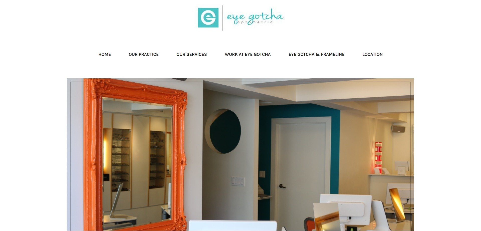
Lovely layout, check. Great theme and color scheme, check. Services laid out for everyone to see in the first glance, check. Office hours and contacts listed on home page and every single page in the footer, check. Take less than 10 seconds to fully load, check. Have locations listed online for easy access, check.
With 2 seconds of load time, this is an excellent website to base your very own optometry website on. It is sleek, stylish, attractive, modern and completely equipped to attract and user and have them browse the website for a long time. Eye Gotcha knows what they are doing and that is enough to keep them on this list.
10. http://eyesonyouoptometry.com

Right off the bat, Eyes On You Optometry certainly has the cheeky title part down pat. Still, they have everything they need on the slideshow-esque website. The home page offers a look at their philosophy and as soon as you swipe left you see their services and the brands they prefer on hand. This approach certainly seems to be working for them since the website takes no more than a couple of seconds to fully load and while they do not have much content on the website, what they have is certainly enough.
11. http://www.pacificrimsoptometry.com

Again, another website that knows perfectly well what they are doing and what is it that they really want to do. Pacific Rims Optometry takes 3.5 seconds to fully load and it features everything necessary for a best optometry website right on the homepage. The services they offer, their contact information, their preferred brands as well as the ability to book an appointment are all there on their homepage. Their approach is rather simple, but they certainly have done some really good work.
12. http://www.richmondvisioncare.com
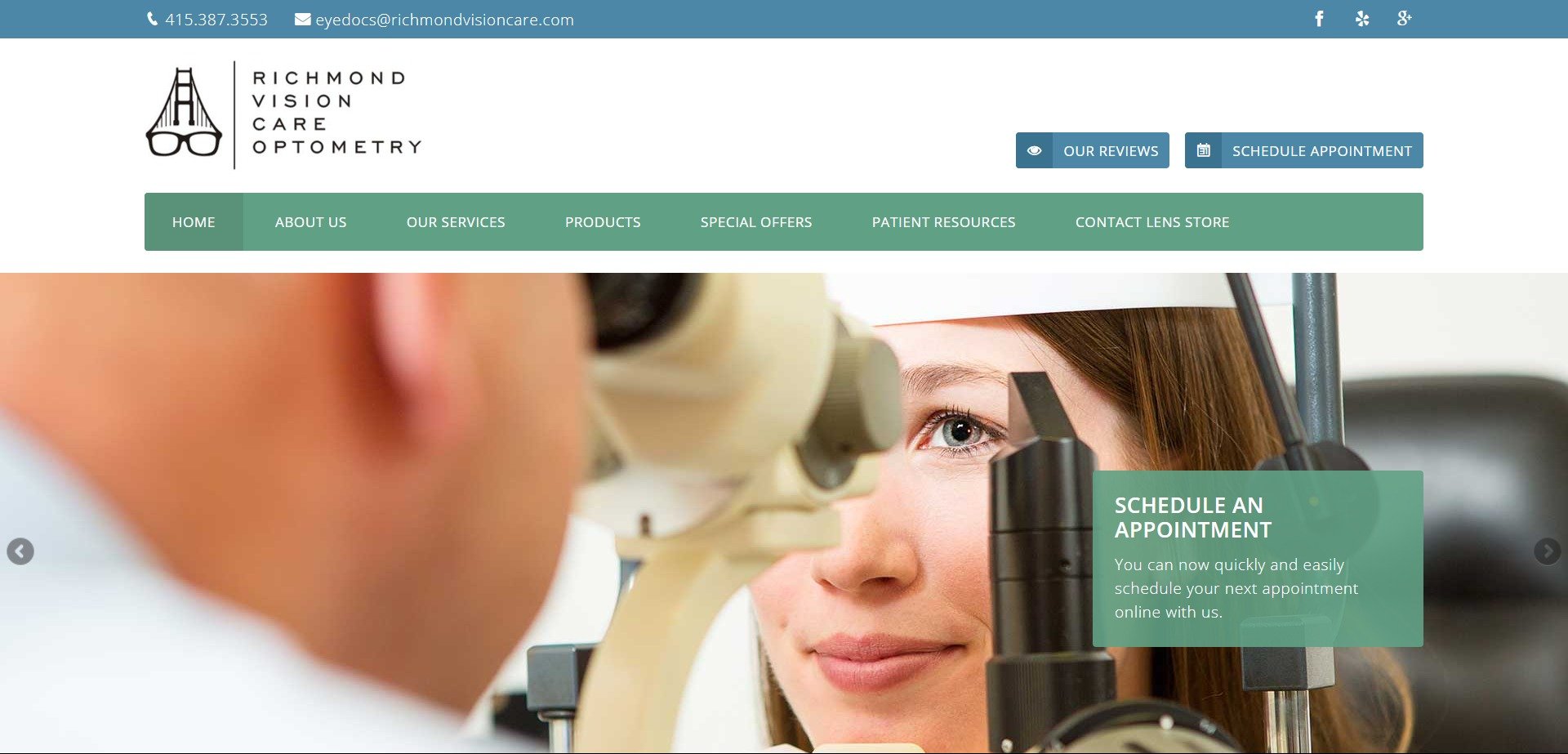
Header and footer are great places to place important information on a website. The fact that header and footer remain constant on the website and features everything good. From contact information to various social media links to the ability to schedule an appointment on the website. This ensures that a visitor will have no problem making an appointment. Additionally, having a 4.8 second load time and an informative, content filled blog doesn’t hurt either.
13. http://www.veooptics.com

Sleek, minimal and modern homepage filled with the best things about the website. A two level drop-down menu allowing you to navigate smoothly and redirects to the very page you are looking for. Scenic views of the bay San Francisco Bay Area, nothing can go wrong with the website such as this one. Veo optics certainly know what they are doing both in terms of an eyecare provider and optometry website. Their website takes no more than 2.3 seconds to fully load which is great. Add to it the content of the page and you have an excellent example on your hands to follow.
14. http://www.monroefamilyeye.com
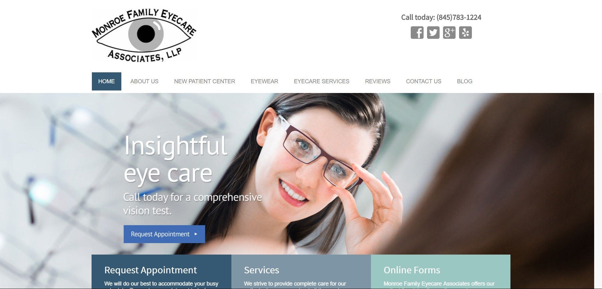
Minimalist and homely was the look that Monroe Family Eyecare was going for. And we believe that they have it down pat. With a simple layout and the blue theme around the website, this optometry website is a good example to follow. They have all the relevant information that any good eye-care website needs and loads in a record time of 4 seconds.
15. http://www.jcpenneyoptical.com

It seems that JC Penny optical has a colorful approach towards life, business and even their website. Their homepage is designed like a glossy magazine cover and gets the attention that it deserves on all fronts. Unlike some of the best optometry websites, JC penny has a virtual try on option. Along with all the basic necessities, is a good thing to have for an optometry website. The website takes a while to load, i.e. 9.4 seconds, the website is responsive and attractive enough to make a user forget that the website took a while to load.
16. http://www.bheyeguy.com
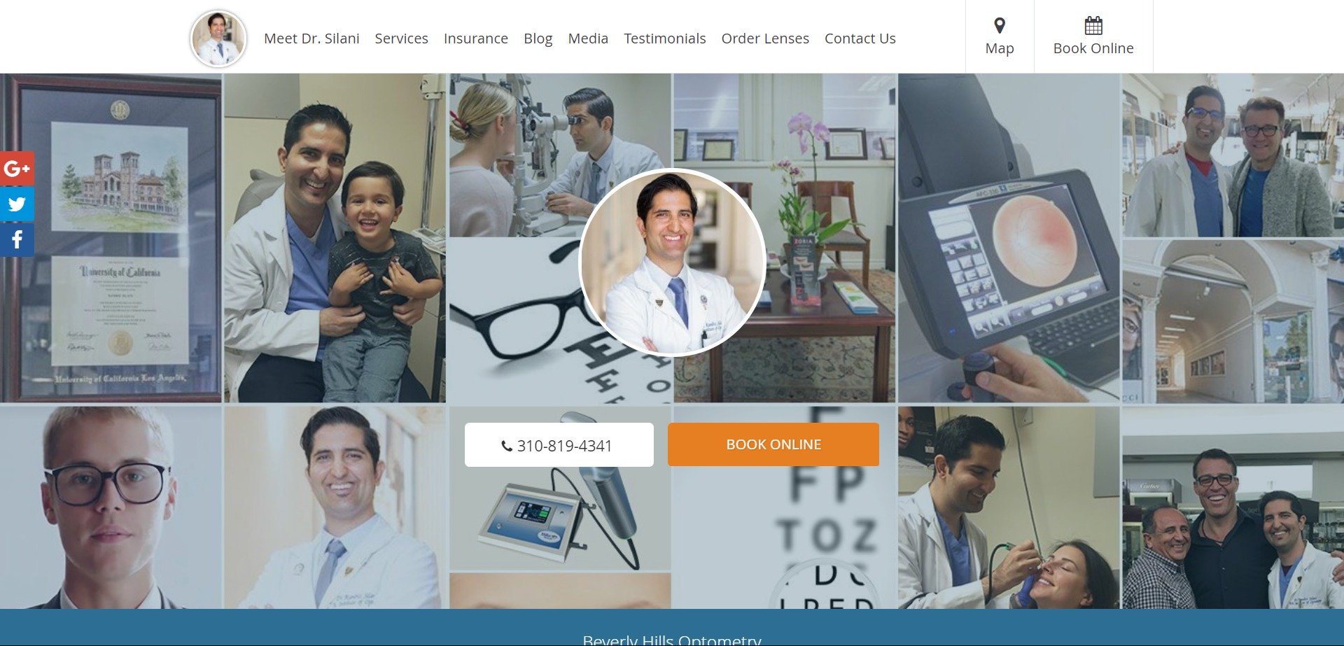
No matter what, collage is something that is never going to get old and Dr. Silani certainly knows it. Right off of the header, we see that Bheyeguy has contact information to book an appointment online listed right above. Moving on, the website takes no more than 8 seconds to load, which is a little out there. But, seeing as how everything a visitor may need is stated right on the homepage certainly compensates.
17. http://optikosoptometry.com
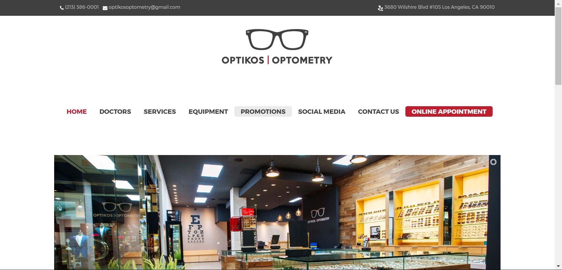
From contact information to address to services provided to book appointment online. Everything is listed on the header as well the one level menu of the Optikos Optometry website. The website is well made, it navigates smoothly and takes only 4.6 seconds to load. This is good all things considered. With lovely images of the store right on the homepage along with updates and offers makes the website stand out. And is enough to keep visitors interested.
18. http://www.richlineye.com
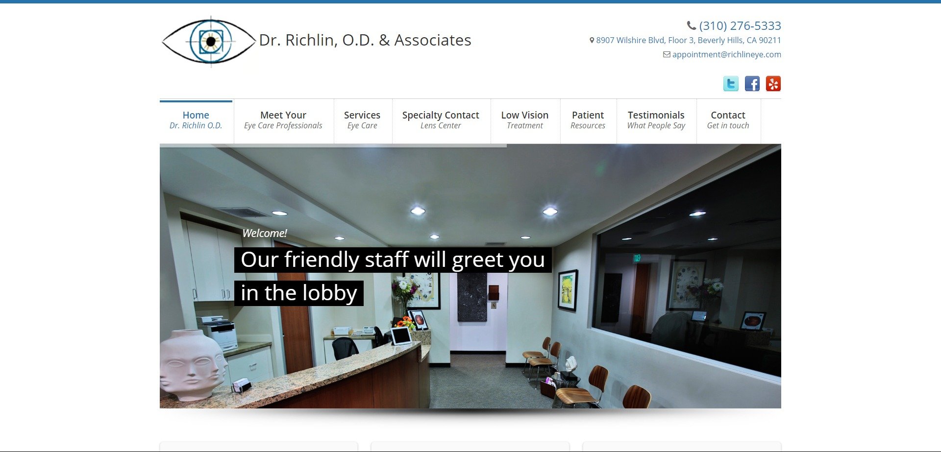
The practice’s website is also premium and state of the art with a clean and well-organized homepage. The theme of the website maybe sleek and modern. But it is filled with content aimed at making sure the visitors know what Richlin Eye is made of. Taking only 2.7 seconds to load, what is not to love about the website.
19. http://www.ccrsclearvision.com
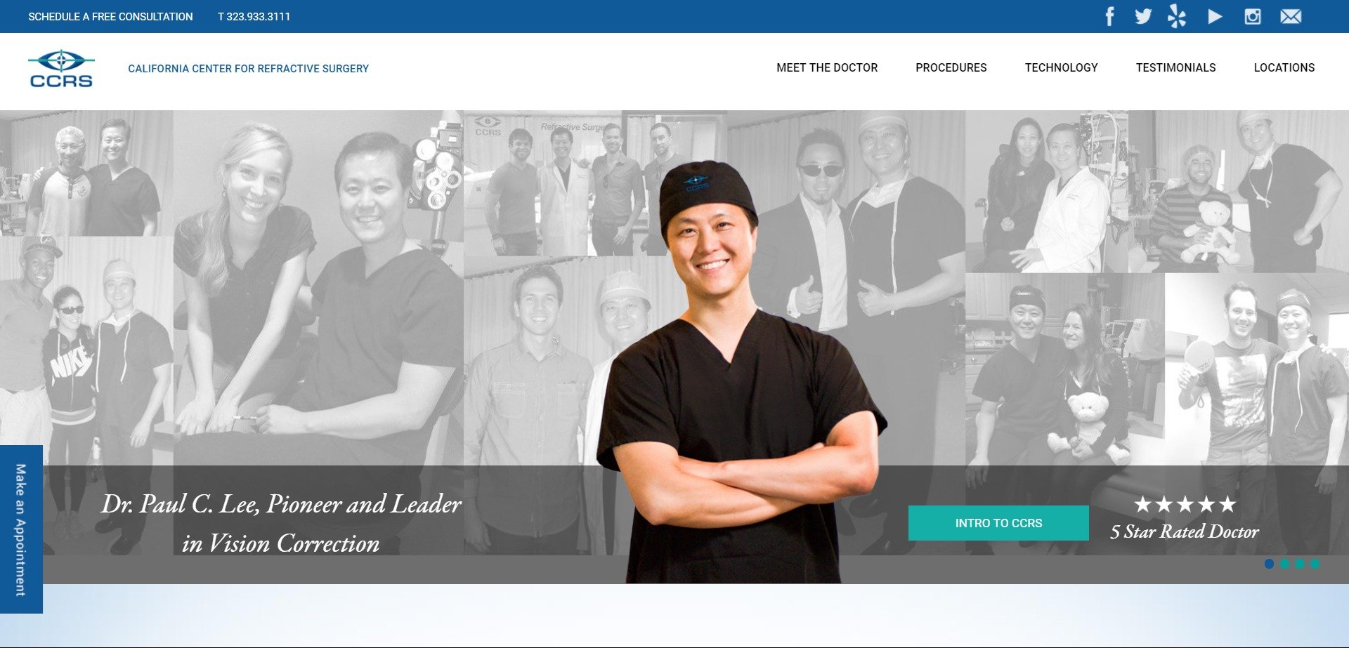
Endless scroll is an elegant option of websites, especially those that feature gossip blogs. These sites usually also feature a large page size. Unlike those sites, a large page size is not common to optometry websites. They usually prefer quick loading pages that are not that large. But, CCRS Clear Vision know how to work a large page size of course. By filling with all the possible information about them a new user may need. While it may not work for most websites, it seems that this approach is certainly working for them.
20. http://www.elportaloptometry.com

A colorful, well-designed layout with a die-for theme is a combination that has something going for this website. Although they could use some work on the font front. The amount of information is enough to make up for the font and the slow load time of the page.
The Bottom Line
So there you have it, simply follow how websites are doing and and you will be sorted. Plus, you always have Situdio here for you to integrate the best things about these websites. These designs will help you get a hint of what you missing in your site, and help you redesign your optometry design.We can look into your needs, see what you want and ensure that you are a part of the list of 20 best optometry websites the next time around.



0 Comments
Trackbacks/Pingbacks