taylorjenkinsreid.com
Author
Taylor Jenkins Reid
Book Types
Fiction
Fonts
Tungsten Comp A, Georgia, Gotham SSm A
Colors
What they did well:
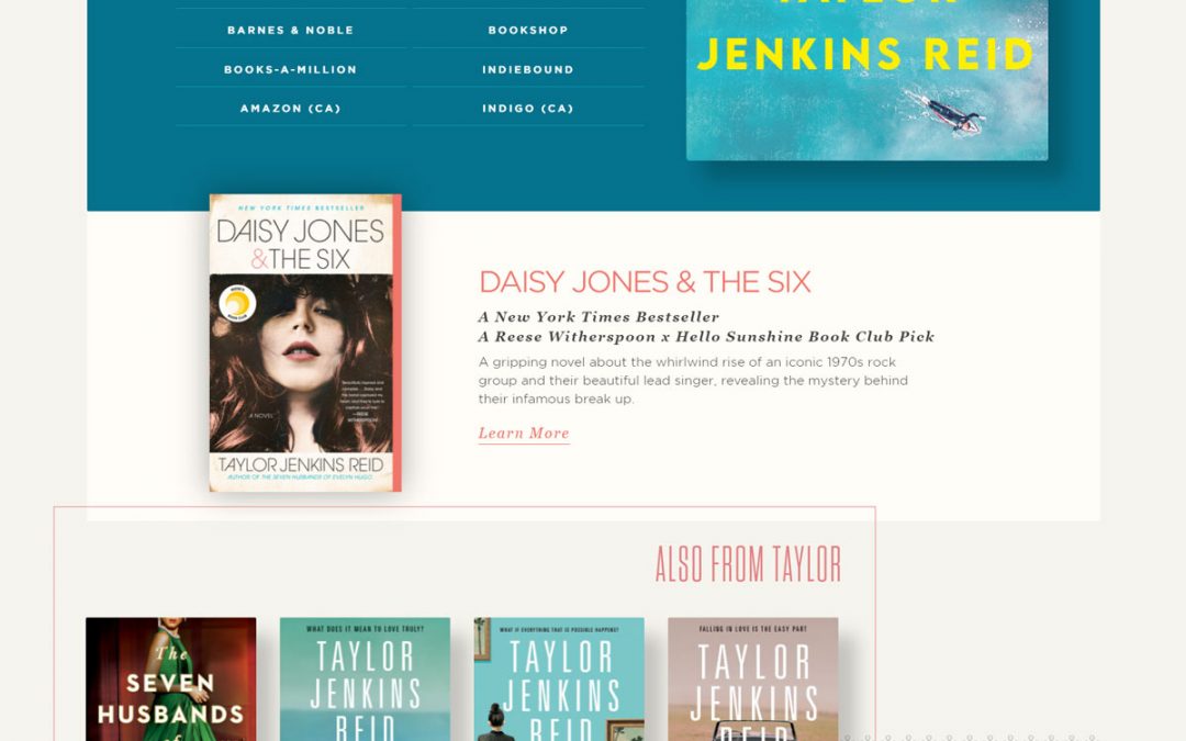
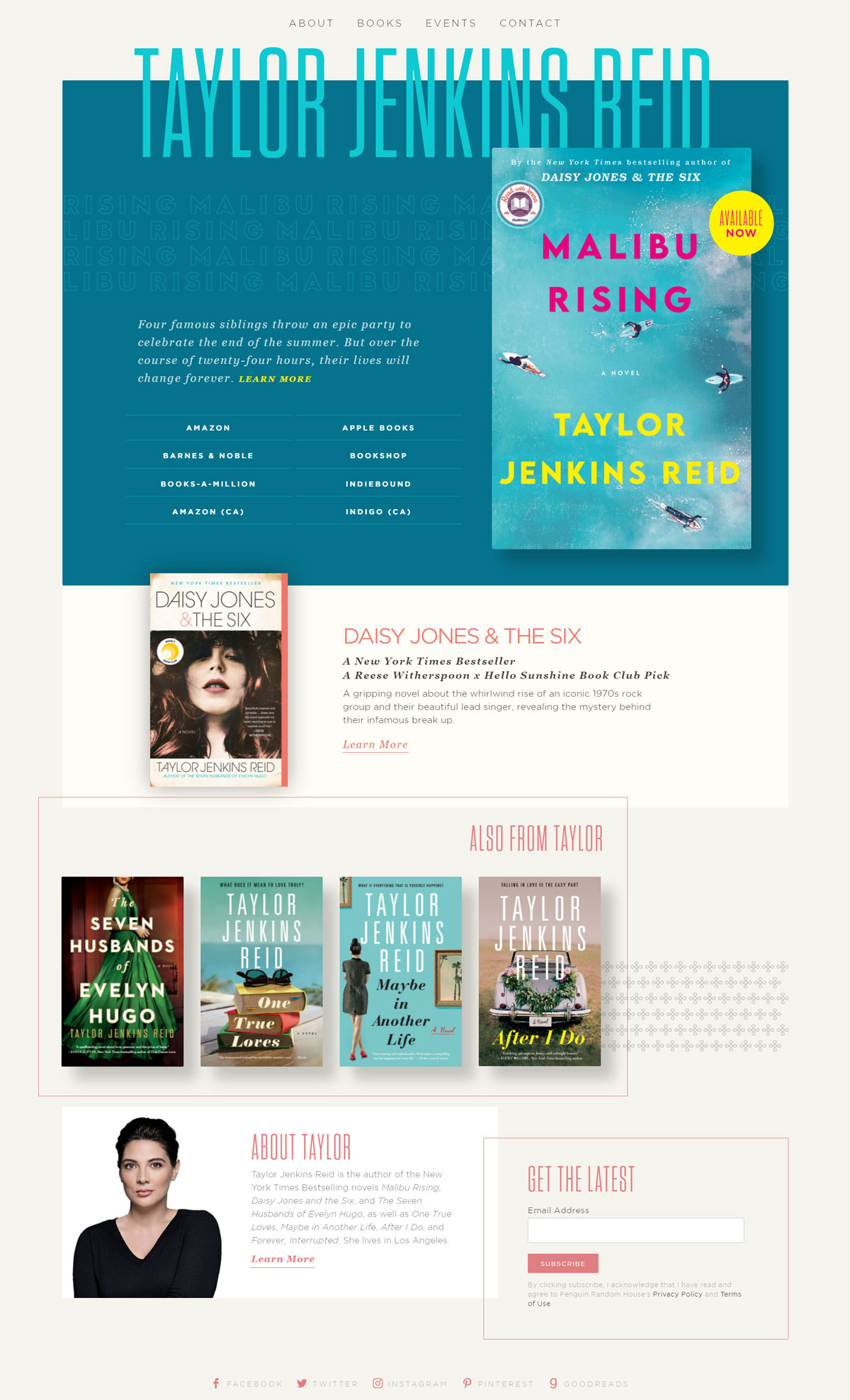
- Advertising of upcoming books is phenomenal and eye-catching.
- Author’s name is the first segment of wording to be seen by the viewer.
- Navigation bar is easy to use, simplistic but efficiently directs the user.
- Shopping access for the books is easily seen below the upcoming book’s intro.
- Social media links are included at the bottom of the site and accessible.
- About the author is short, succinct, and complete.
- Negative space is used perfectly to bring focus to the key elements of the site.
What to consider changing:
- Excessive book advertising by including the “Also from Taylor” section on homepage.
- No blog post is on the website and no links available to a blog site either.