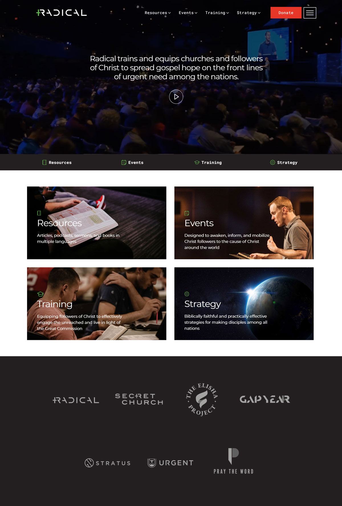
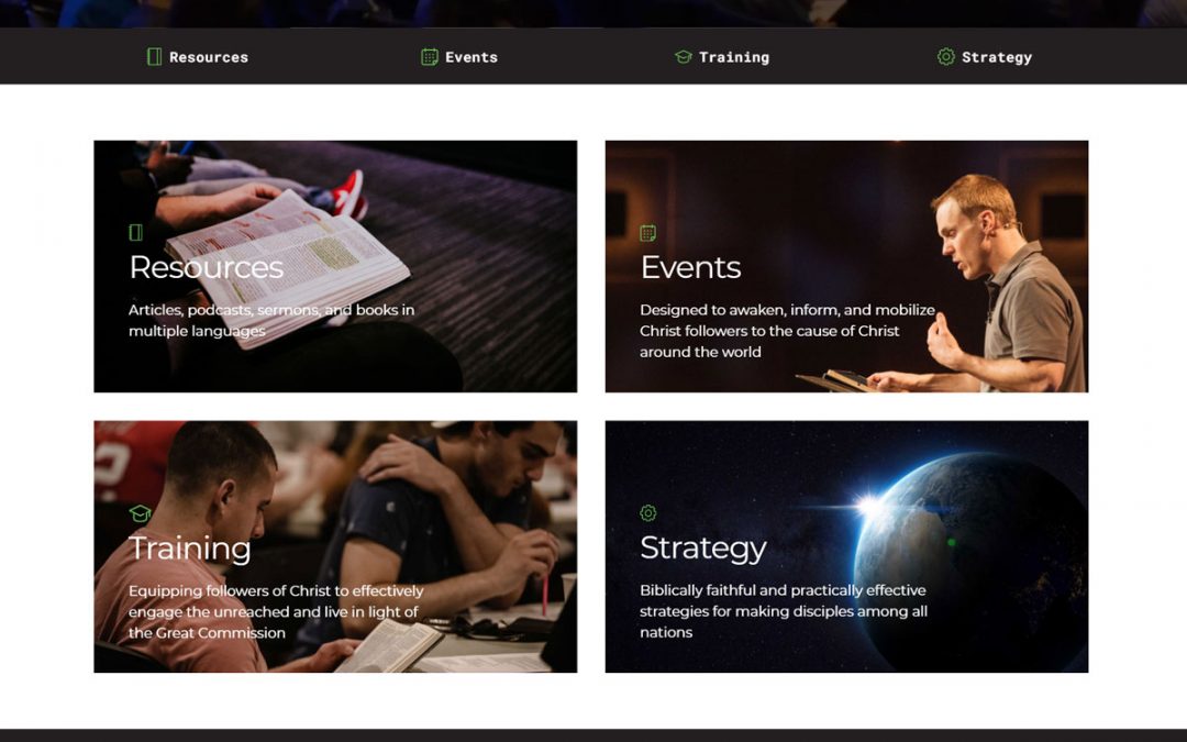
radical.net

Author
David Platt
Book Types
Religion
Fonts
Montserrat, Roboto Mono
Colors
What they did well:
- Video banner draws the audience in with an easy to access video.
- The navigation bar stands out using the white text against a dark background
- Consistent color patterns created continuity on the site.
- Mobile and PC upload speeds remained consistent and high.
- The focus of the website is evident, it is a site for christian fellowship not just books.
- Accessibility and navigation on the site is easy to follow and natural for the user.
What to consider changing:
- Books could be advertised more if that is the focus, but here it is not.
- The theme of this does not appeal as an author site.
- Imagery is portraying an experience, in this case a christian experience.
- The focus of the site is not on literature or the author.
