miriammonfredo.com

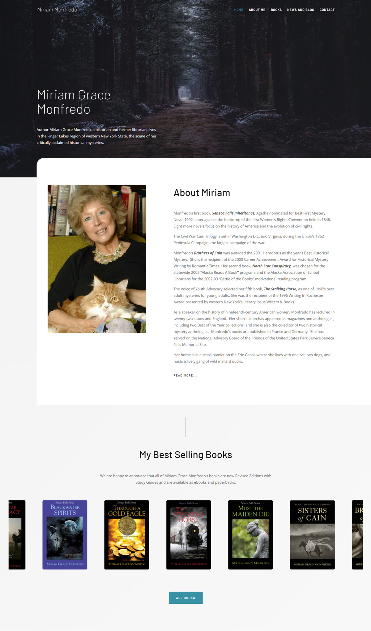
The first look on Miriam Monfredo’s website shows a picture of a dark forest with mist surrounding the area. This gives a sense of mystery to the reader and tells the writing style of the author. The first image on the landing page is the most important. It can be a slider but most often we see a still image. Marketing experts’ advice for authors is to set the mood of the website according to their writing style.
Author
Miriam Grace Monfredo
Book Types
History and Mystery & Thrillers
Fonts
Barlow, Open Sans
Colors
What they did well:
- Miriam provided an excellent background in hero which sets the mood and tone for mystery as her focus is on historical mysteries.
- The layout is easy to follow and flows from the reader’s perspective.
- The tag line for Miriam within the hero is excellent and provides a succinct summary of her work.
- Miriam draws the reader’s attention to the books by utilizing images
- Economy of language is utilized well here.
- There’s a specific page for each book with reviews and links to buy the book on Amazon and Smashwords.
- 3-D book design enhances website appearance, drawing attention to her books.
What to consider changing:
- There could be a greater focus on the books that Miriam has produced as its location is distant from the focal point of the website.
- Website upload speeds can be improved with limited images and features. Miriam’s books could also be larger in their image and her about me section should follow.
- The focus needs to be on promoting a book or books in general.
- Miriam should promote an upcoming book if she has one in the works because this will build anticipation for her fans and audience.
- She must keep the blog up-to-date.
